Telkom Indonesia
Pijar Sekolah
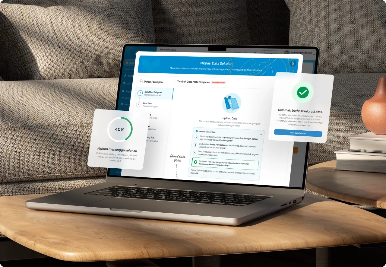
Pijar Sekolah is a digital learning platform that has transformed education in Indonesia.
- Company
- Telkom Indonesia
- Role
- Product Design Principal
- Timeline
- 3 months
- Platform
- All platforms
- Skills
- Product Design, UX Research, Design System, UI Animation
- Tools
- Figma
Pijar Sekolah is an integrated digital learning platform that has played a key role in transforming the education landscape in Indonesia. With a strong vision and mission to advance education nationwide, Pijar Sekolah provides innovative solutions for schools, teachers, and students. Through thousands of engaging digital contents — including digital books, instructional videos, and virtual laboratories — the platform creates an effective and enjoyable learning environment for students. It also facilitates Computer-Based Exams (CBE) with tools that support question creation, exam scheduling, supervision, and result checking.
Background
Between 2020 and 2023, Pijar Sekolah operated with fairly impressive results; however, we believed there was still potential to maximize its performance.
The design team ran ideation and brainstorming sessions for a quick assessment of the existing product, and we collectively agreed that the platform was outdated in terms of UI and highly conventional in UX — across both the Web App for teachers and admins and the Landing Page.
The next step?
Looking for allies!
After the design team aligned on the decisions and action plan for enhancing Pijar Sekolah, we ran a series of alignments with cross-functional teams — product, research, and operations. We all agreed on the main goal of the effort: to revamp and redesign the platform.
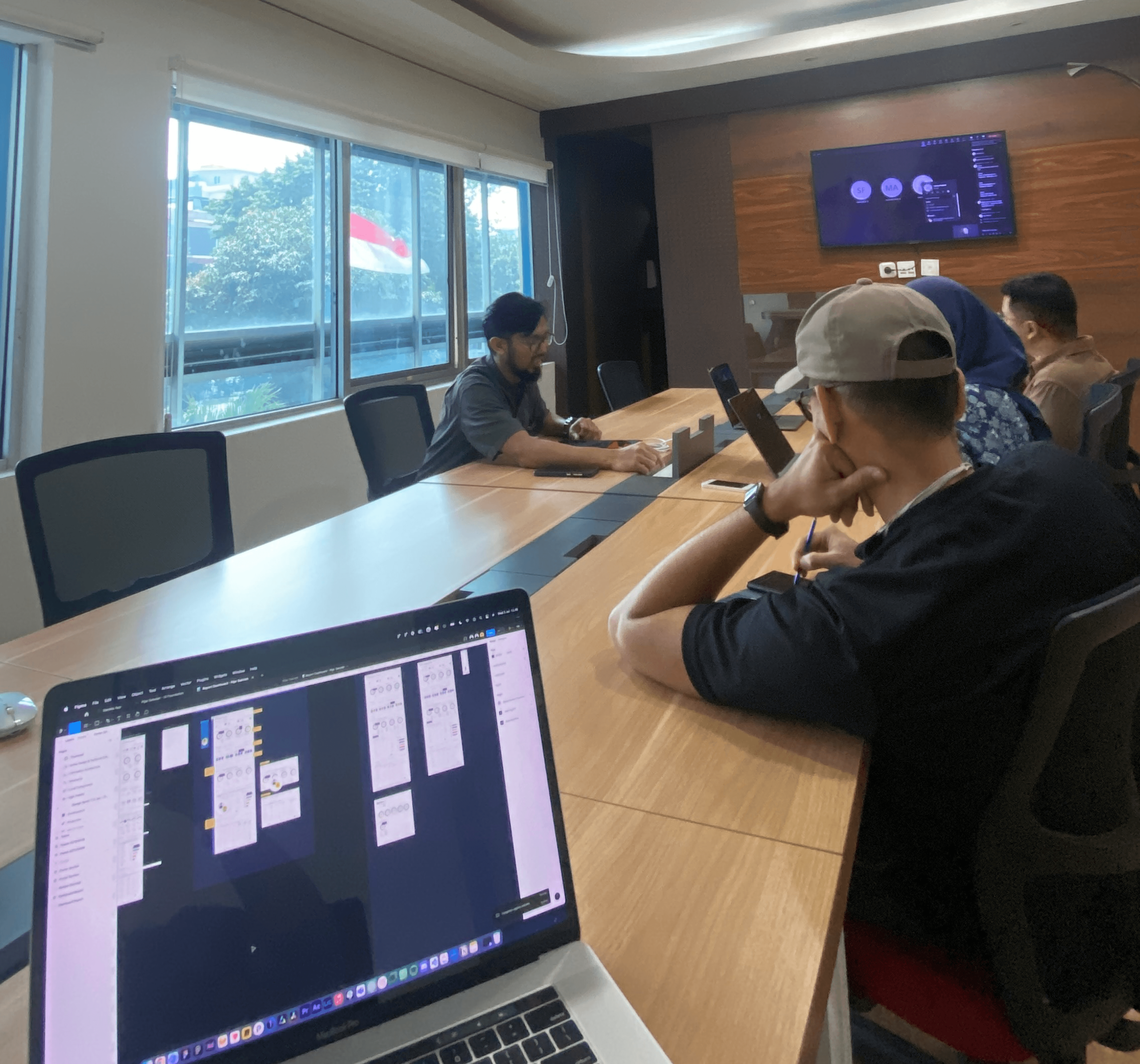 chat with product
 aligning cross vision
 discuss with research
Defining the problem
After a series of alignments, we defined several key problems that were crucial — and most feasible — to solve.
Problem 1 — Low user engagement and usability issues
Teachers and administrators found the interface cluttered and difficult to navigate, especially when accessing key features like attendance, exams, and reports. The homepage was overloaded with complex data, including detailed charts and statistics, making it hard for users to digest.
Problem 2 — Lack of awareness and standalone acquisition
Many schools were unaware of Pijar Sekolah’s full range of features and its potential as a standalone platform. Acquisition was mostly dependent on bundling with other Telkom services, showing the need for stronger branding and clearer communication of value.

Problem 3 — Inconsistent user experience across platforms
There was a lack of consistency between the web app, mobile app, and landing page, leading to fragmented user experiences across different devices.

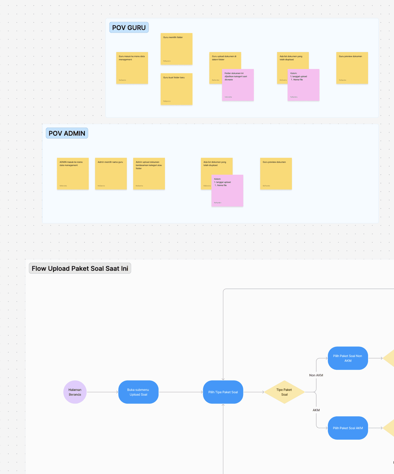
Problem 4 — Lack of monitoring tools for parents to track their children
The increasing demand for parental interaction and supervision features represented significant value — involving parents in the platform can boost Pijar Sekolah’s usage in the market.
With 220,000 active students using Pijar Sekolah for each exam, there is substantial potential for that number to translate into active use of a parent app.
Beyond monitoring, the parent app could also facilitate school fee payments through the e-payment (SPP) feature — reducing reliance on WhatsApp and lowering the cost of e-payment processing.

Goals
- Improve usability and user engagement
- Increase standalone subscriptions and awareness
- Create a consistent and seamless experience across platforms
- Optimize data presentation and information architecture
- Enhance content management and reporting tools for educators & parents
Design process

User research
Gather insights from key stakeholders — teachers, school administrators, students, and technical teams — to understand their expectations, pain points, and goals with the platform.
Qualitative research
- Interviewed teachers about their daily interactions with the platform — attendance tracking, exam management, and task creation.
- Spoke with school administrators to gather feedback on school management and reporting features.
- Collaborated with the technical team to assess current limitations of the platform’s architecture.


Key findings
After multiple interview sessions with teachers, school administrators, students, and technical teams, we gathered valuable insights to guide the redesign.

Visual asset explorations
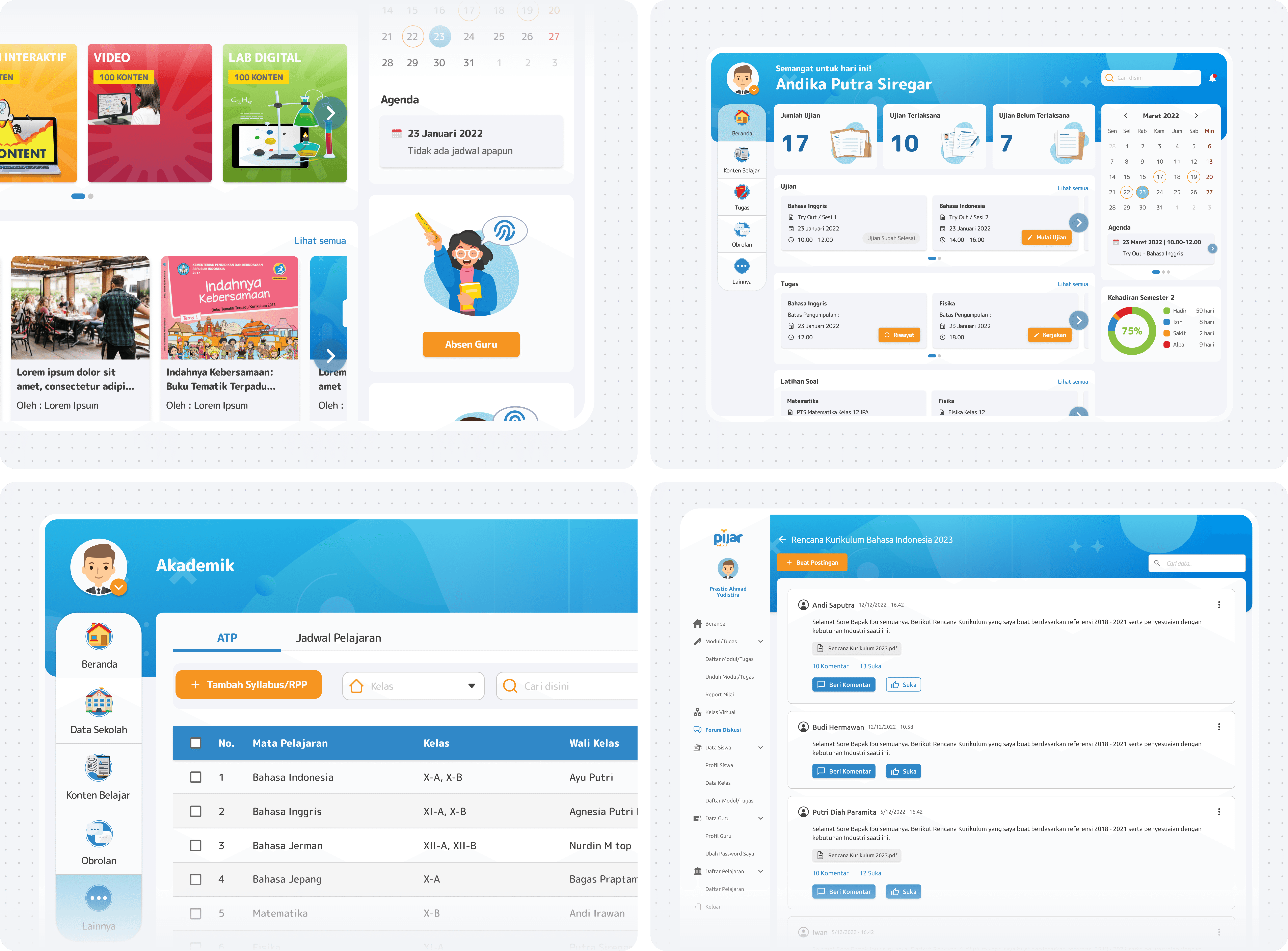
We collaborated with the Visual Design Hub team from Telkom DEX to define a new visual and asset identity for Pijar Sekolah — running extensive explorations toward a fun, vibrant, and imaginative brand guideline.
- Fun & Friendly
- Formal but Playful
- Vibrant & Dynamic
- Imaginative
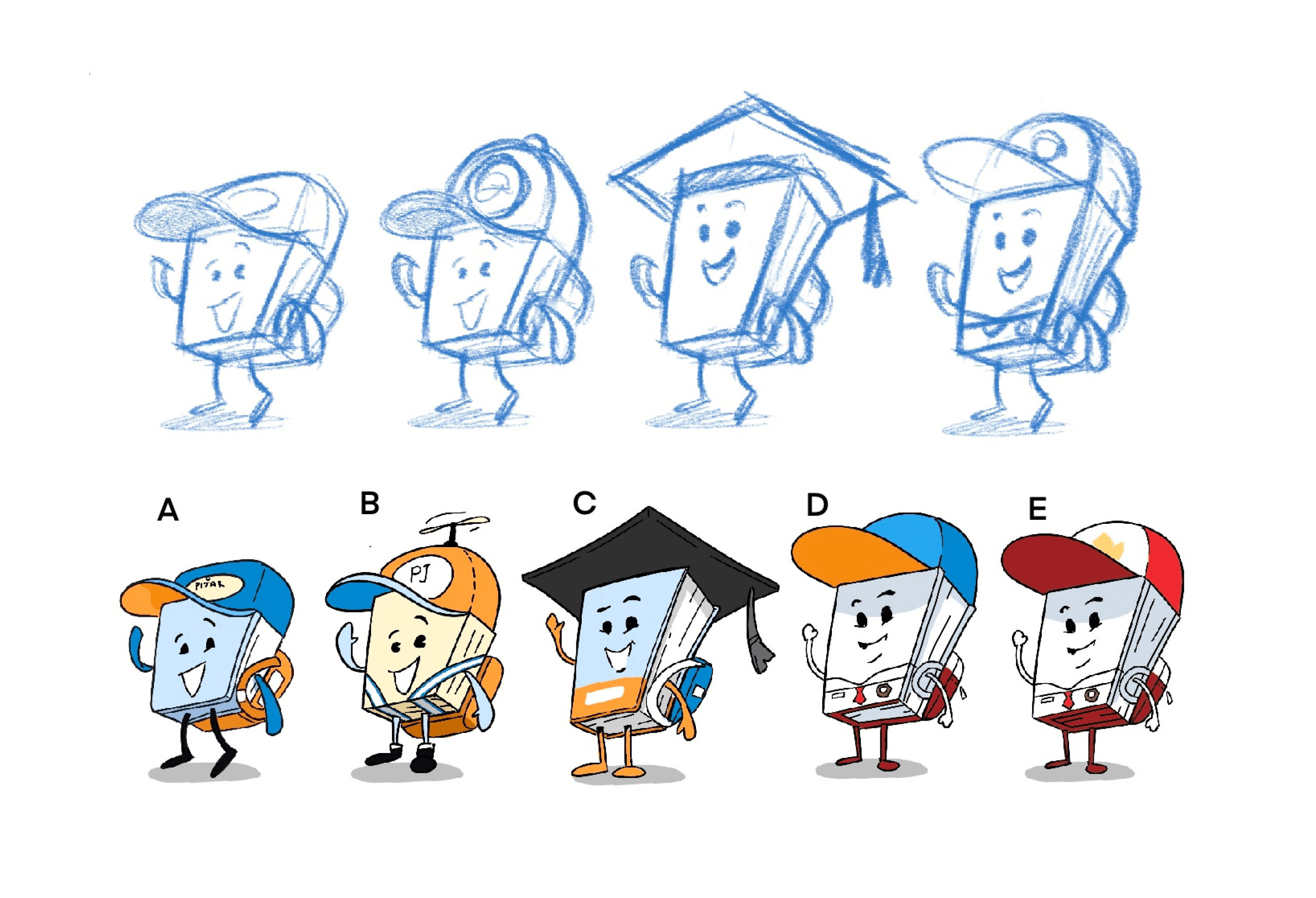
Sketching & idea sparking
We explored and selected styling ideas for the characters that serve as the key visual elements of Pijar Sekolah’s illustrations and branding. These characters play a central role in shaping the overall look and feel of the brand identity.




Dashboard for admin & teacher redesign
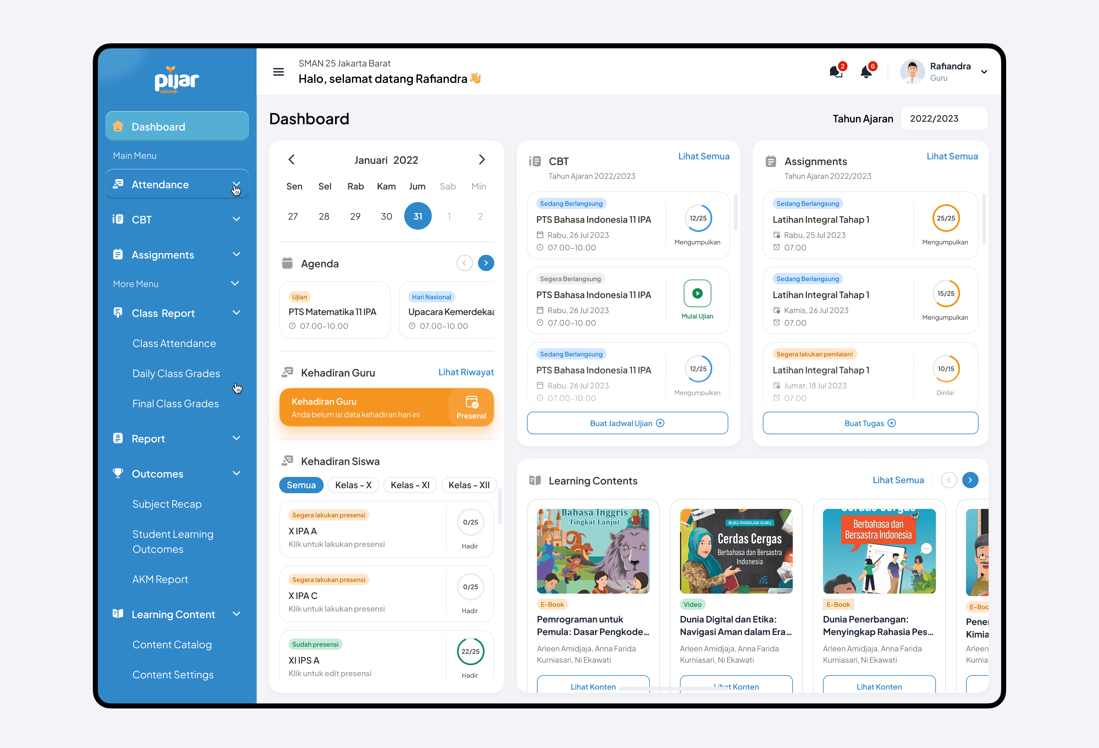
As a teacher or administrator, I need a simplified and intuitive interface for accessing key features like attendance, exams, and reports — so I can navigate efficiently without being overwhelmed by complex data and cluttered visuals.

Early explorations
I explored several homepage design options, which also serve as a trigger pattern for other designs in Pijar Sekolah. I then ran concept testing with users to learn whether the design met their needs or required further adjustments.

Insights from in-depth interviews
- Confusing help feature — its purpose was unclear, leaving users confused.
- Missing learning content — users expected learning content to stay visible on the main dashboard.
- Too many menus — the dashboard had so many menus it was hard to tell which mattered.
- Simple and useful statistics
- Helpful attendance reminders
Final dashboard design 🎉
After in-depth interviews for the preference test, we finalized the design. The new version offers a clearer menu, reinstates the learning content, emphasizes the 3 main features, and surfaces an overview of those features directly from the homepage.

Mobile app for parents
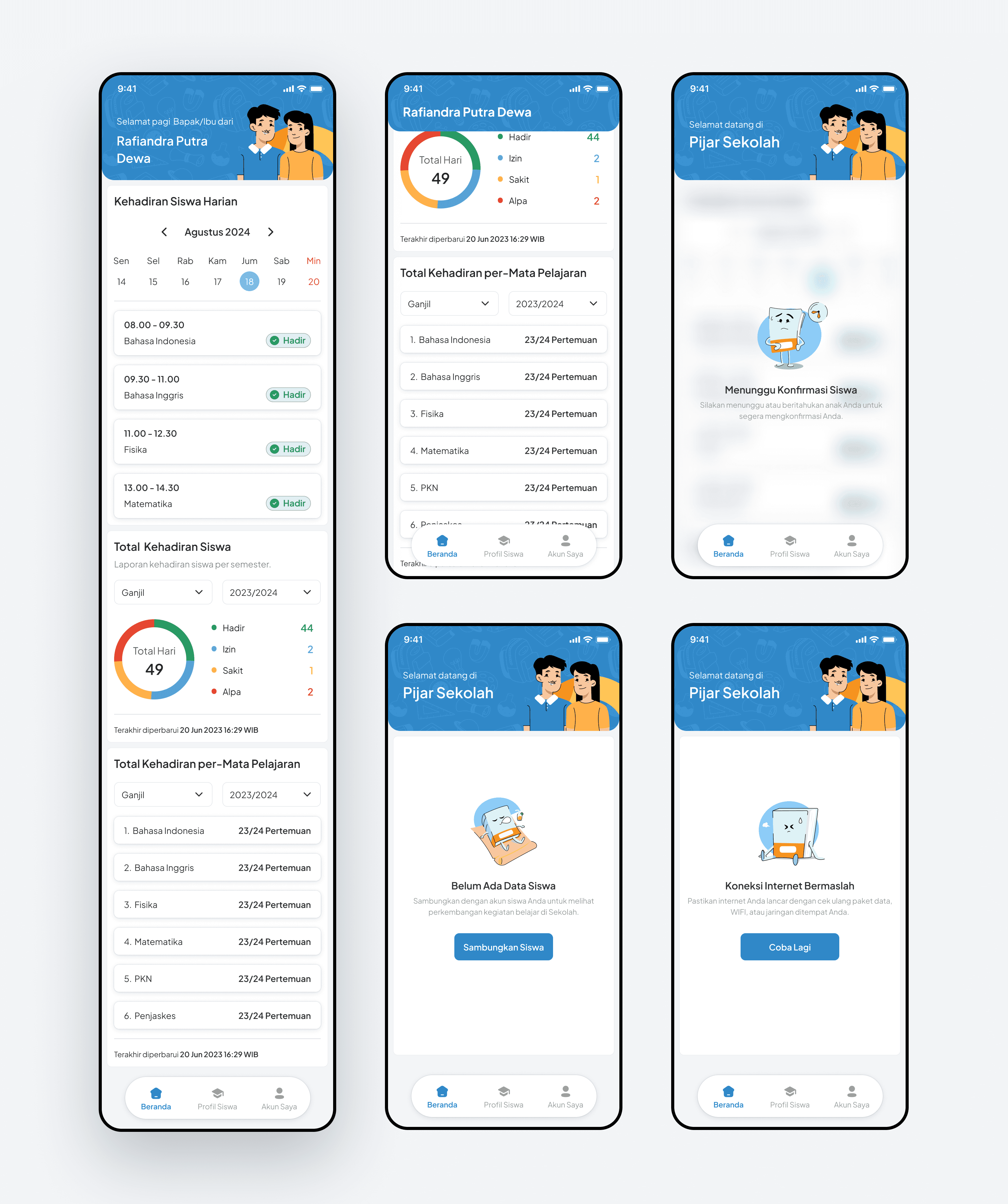
As a parent, I want better tools to monitor my child’s activities and progress in school — so I can stay informed and support their academic journey effectively.


Parent’s mobile app
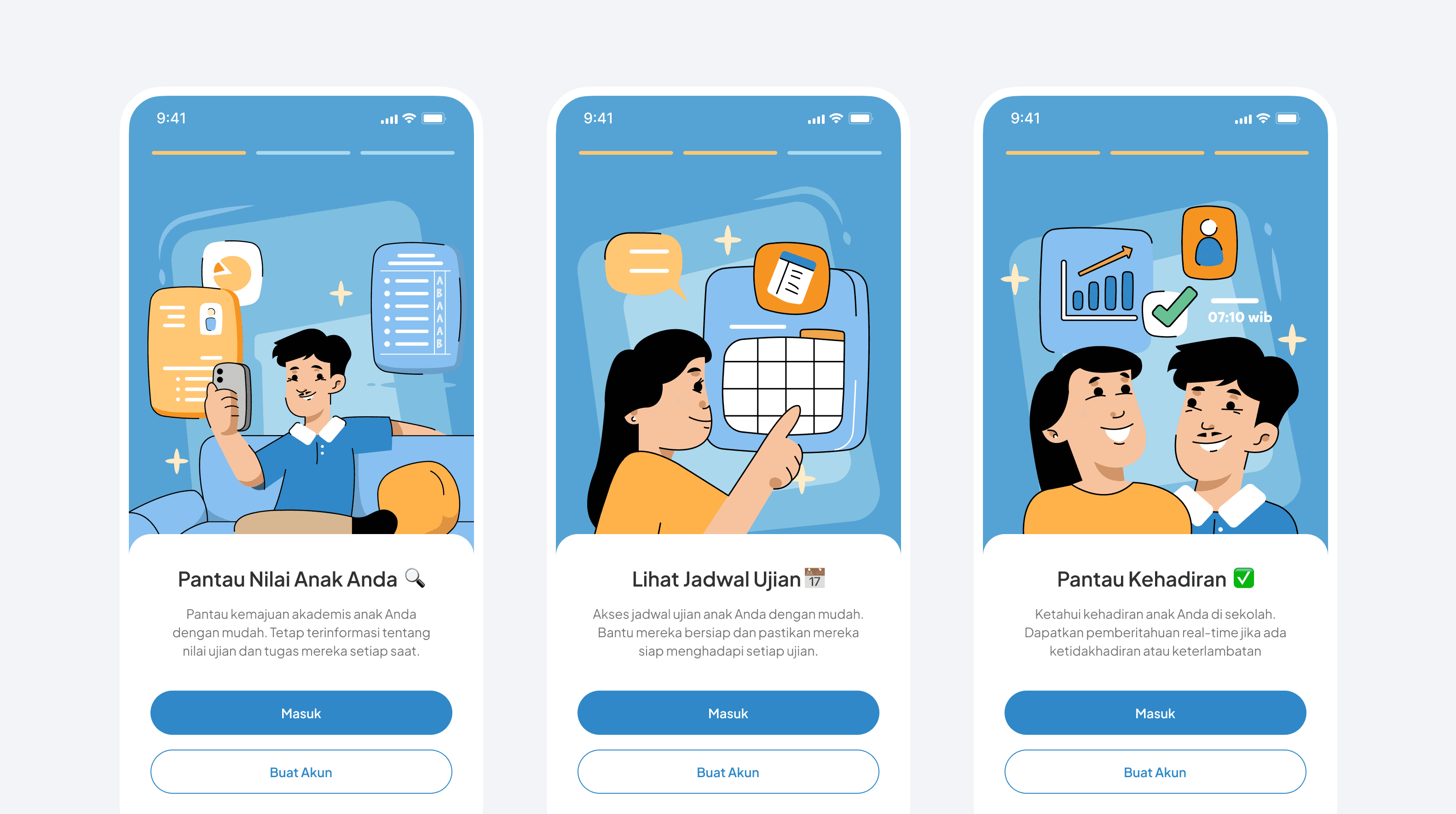
Insights from parents made it clear they needed a dedicated app to monitor their children’s progress. By incorporating the new, more playful and flexible brand guidelines, the app became friendlier and easier to use — especially for parents.
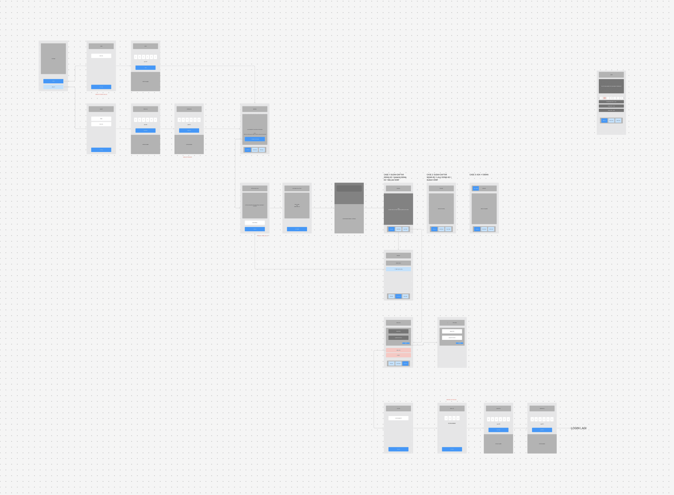
Initial wireframe & sketch
Animated splash screen
To enhance interactivity, I designed an animated splash screen, incorporating a fresh illustration style for Pijar Sekolah.
Seamless sign up and create PIN code

Easy sign in using PIN code

Informative, user-friendly dashboard
New landing page redesign
As a school administrator, I want to understand Pijar Sekolah’s full features and value as a standalone platform — so I can decide to subscribe without bundling it with other services.

New landing page
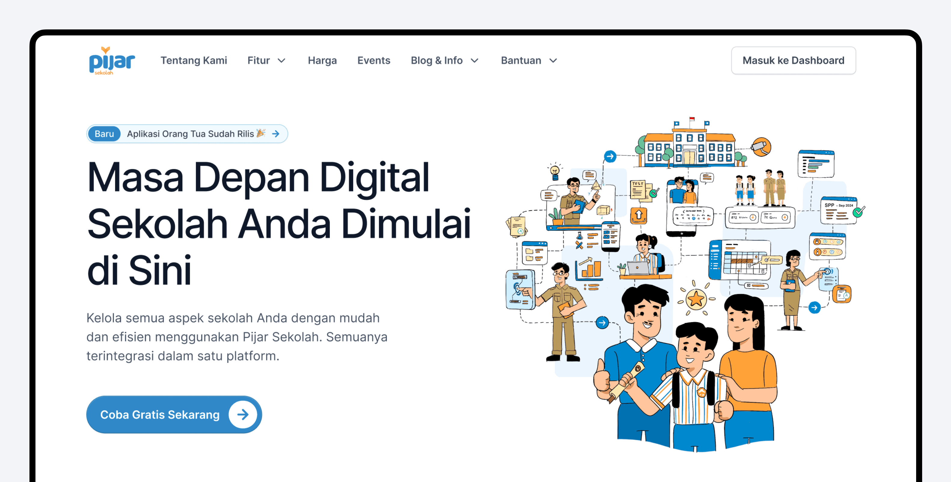
To enhance awareness and social proof — and to support the account-manager team in selling and explaining Pijar Sekolah more effectively — we redesigned and revamped the homepage.
Preference test survey


Test results
Based on the survey, Option A was preferred: it better highlights the solutions Pijar Sekolah offers and piques users’ curiosity, prompting them to seek more information and scroll further down the page.

Final landing page design 🎉
The redesign works!
Impact & results
After redesigning the Pijar Sekolah web app, parent mobile app, and landing page, we tracked key performance metrics. Here are the results:
- 45%
- User engagement increaseA significant 45% increase in users visiting the 3 main features of Pijar Sekolah.
- 15%
- Session duration increaseUsers are spending 15% more time on the website.
- 22%
- Pages per session increaseA 22% increase in the number of pages visited per session.
- 110%
- User downloadsA significant increase in downloads of the parent mobile app, which had not been ready for launch prior to the redesign.